


Quick answer: A scalable SaaS dashboard for the MENA market must be bilingual (Arabic RTL + English LTR) from day one, load in under 2 seconds on mobile, and grow from 10 to 10,000 users without redesign. At Hirodots, a customer-facing dashboard typically costs QAR 80,000–160,000 and ships in 2–4 months as a web app.
At Hirodots, most of the SaaS products we build from our base in Lusail start with the same problem: a growing organisation is drowning in disconnected tools and needs one screen that makes sense of everything. Across nine years of delivery work, we have learned that a scalable dashboard is not about adding more charts — it is about giving each user exactly the information they need to act on, and nothing else.
What makes a SaaS dashboard actually scalable?
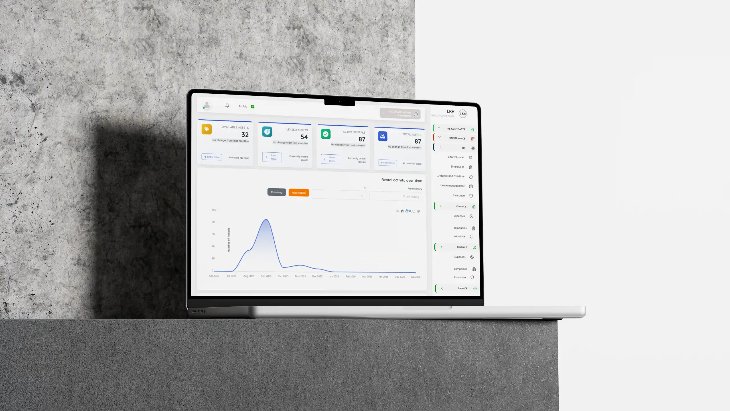
A scalable dashboard keeps performing as your data, your team and your feature set grow. When we designed LKH, an all-in-one HR & Finance Suite that unifies employees, leave, expenses, roles and permissions in a single workspace, the layout had to survive a client doubling their headcount overnight. We architect the information hierarchy first — primary metrics on top, drill-downs one click away — so the interface holds up whether a business has ten users or ten thousand.
How do you design one platform for many different roles?
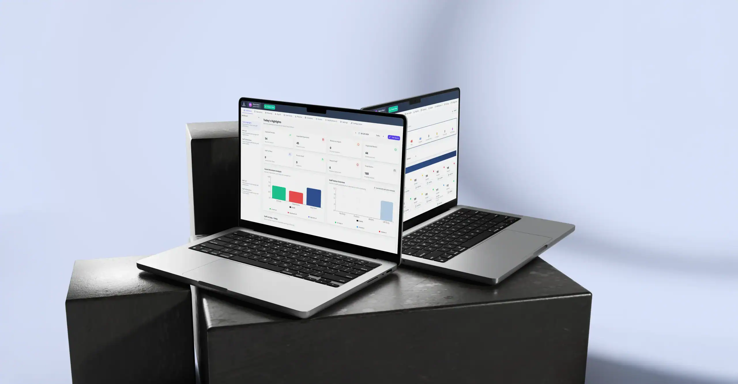
Role-based access control sits at the centre of how we work. In both LKH and Xionys — our all-in-one hotel operations platform that unifies housekeeping, workforce, payroll, inventory and analytics — a receptionist, a housekeeper and a general manager open the same product and see completely different things. We map every role to its real job before designing a single screen, so no one is hunting through menus that were never meant for them.
Why does real-time data change dashboard design?
Static month-end reports no longer match how fast businesses in the region move. Xionys tracks room status in real time so housekeeping and the front desk stay in sync, and LKH surfaces live HR and finance insights instead of spreadsheets. Designing for live data means planning for loading states, empty states and constant change — the details generic templates skip, but which decide whether a product feels trustworthy.
Designing for growth in Qatar and the GCC
Companies across Qatar and the wider GCC are scaling quickly, often bilingually and across several locations. We design for that from day one: clean typography that survives dense data tables, layouts that adapt from a manager’s desktop to a supervisor’s phone, and workflow automation that removes the repetitive steps teams should never be doing by hand.
What we have learned building SaaS for real clients
The dashboards we are proudest of are the ones users forget they are using. That only happens when every design decision is grounded in how a real business actually runs. If you are building a SaaS platform and want a dashboard that scales with you rather than against you, our team in Lusail would be glad to help — reach us at [email protected].
What does a SaaS dashboard cost in Qatar?
Dashboards are web applications, so pricing follows the web-app ranges in our 2026 development cost guide:
| Dashboard type | Typical cost | Timeline | Example scope |
|---|---|---|---|
| Internal tool | QAR 35,000–80,000 | 4–8 weeks | Team KPIs, reporting, single role |
| Customer-facing SaaS dashboard | QAR 80,000–160,000 | 2–4 months | Accounts, billing, Arabic+English, multi-role |
| Analytics platform | QAR 160,000+ | 4–6+ months | Real-time data, integrations, white-labelling |
What makes a dashboard work in Arabic?
- True RTL mirroring — navigation, charts and tables flip direction, not just the text; numerals and dates follow local convention.
- Arabic typography — UI fonts like IBM Plex Sans Arabic or Cairo at slightly larger sizes, since Arabic glyphs read smaller than Latin at equal point size.
- Bilingual data entry — users switch language without losing state; exports (PDF, Excel) respect the active language.
We applied all three in XIONYS, the hotel-operations platform we built, and in the LKH HR & finance suite. If you are planning a dashboard, our MVP-first approach keeps the first release affordable.
Frequently asked questions
How much does SaaS dashboard development cost in Qatar?
An internal reporting tool starts around QAR 35,000–80,000; a customer-facing SaaS dashboard with accounts, billing and Arabic–English support typically runs QAR 80,000–160,000; real-time analytics platforms start from QAR 160,000. Timelines range from 4 weeks to 6 months by scope.
Should a MENA dashboard support Arabic?
Yes — roughly half of MENA users prefer Arabic interfaces, and enterprise buyers in Qatar and Saudi Arabia increasingly require it. Proper support means full right-to-left mirroring of layout, charts and tables, not just translated labels.
What tech stack is best for a scalable dashboard?
We typically build with React or Vue on the front end and Node.js or Laravel APIs behind, with charts rendered client-side and data cached aggressively. The stack matters less than the architecture: role-based access, API-first design and pagination from day one are what let a dashboard scale.
How long does it take to build a SaaS dashboard?
An MVP dashboard ships in 4–8 weeks; a full customer-facing product with billing, roles and both languages takes 2–4 months. Starting with the MVP scope and expanding from real usage data is faster and cheaper than building every report up front.


